Behind the Branding: commonsku Brand Evolution

Over a decade has passed since the inception of commonsku, and our journey has been nothing short of remarkable. (Listen to commonsku turns 10)
As our company has grown and evolved, so too has our brand, adapting to better represent our mission, values, and the dynamic industry we serve. Today, we're excited to unveil the commonsku brand’s latest chapter which encapsulates our dedication to staying at the forefront of innovation and technology.
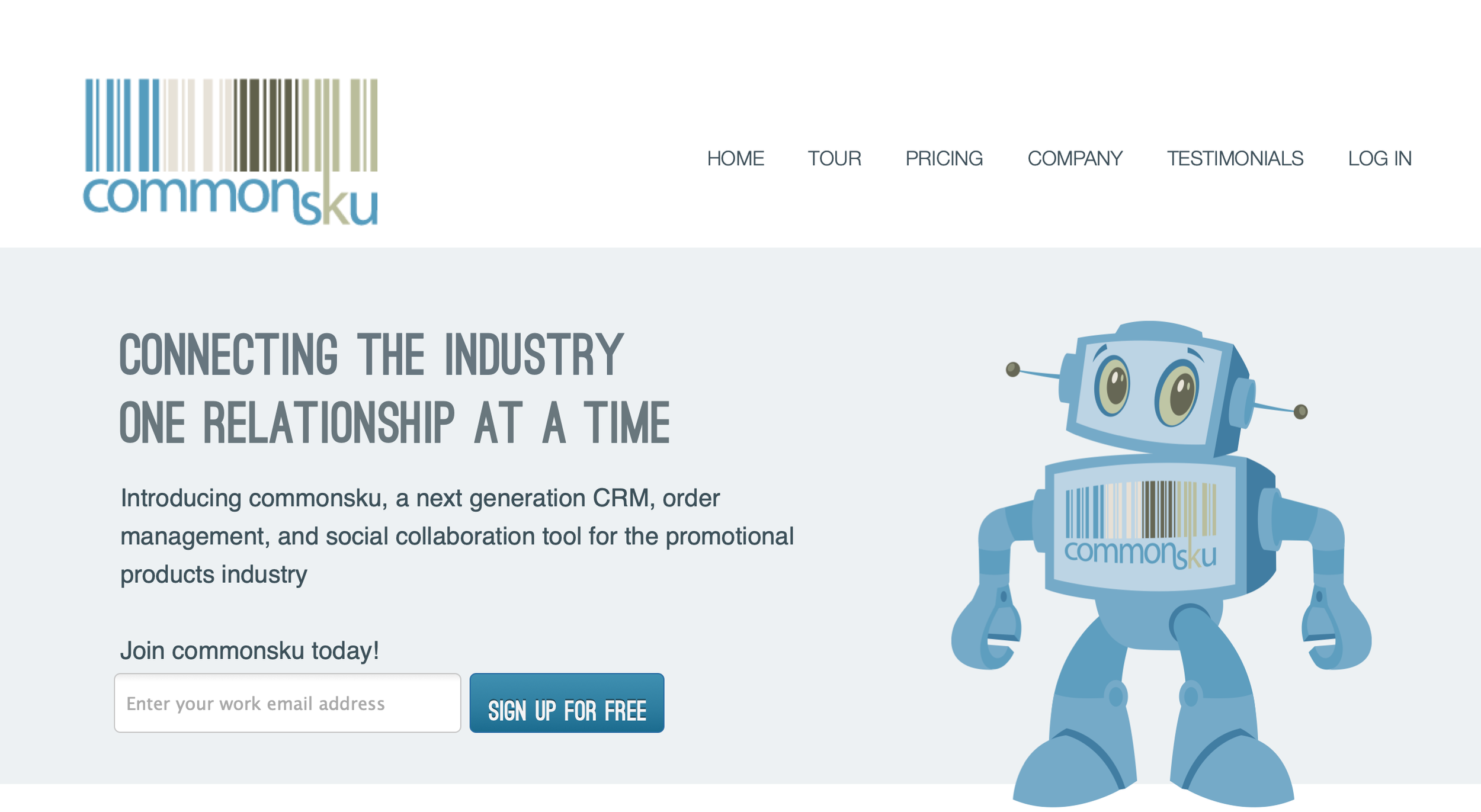
The journey began with our iconic barcode, a nod to the "sku" in our name, symbolizing the multifaceted world of products and skus within the industry. Over time, we realized that our identity needed to mirror the efficiency and vibrancy of the product-based businesses we support. Thus, we ventured into the "product" side of our brand and had some fun along the way – and no, our barcode still won't scan!

Enter skubot, our beloved mascot. Conceived to infuse our brand with a unique personality, skubot embodies the essence of commonsku: reliable, approachable, and fun. We've chosen a path less traveled by many software companies – one that emphasizes personality and community. We believe that trustworthiness and a strong product can harmonize with a likable and relatable brand. skubot, brought to life through the talents of illustrator Tee Hamilton, embodies this vision.

Over the years, you have watched our company grow and evolve, and we felt it was time for our brand to do the same. (Read the story behind commonsku)

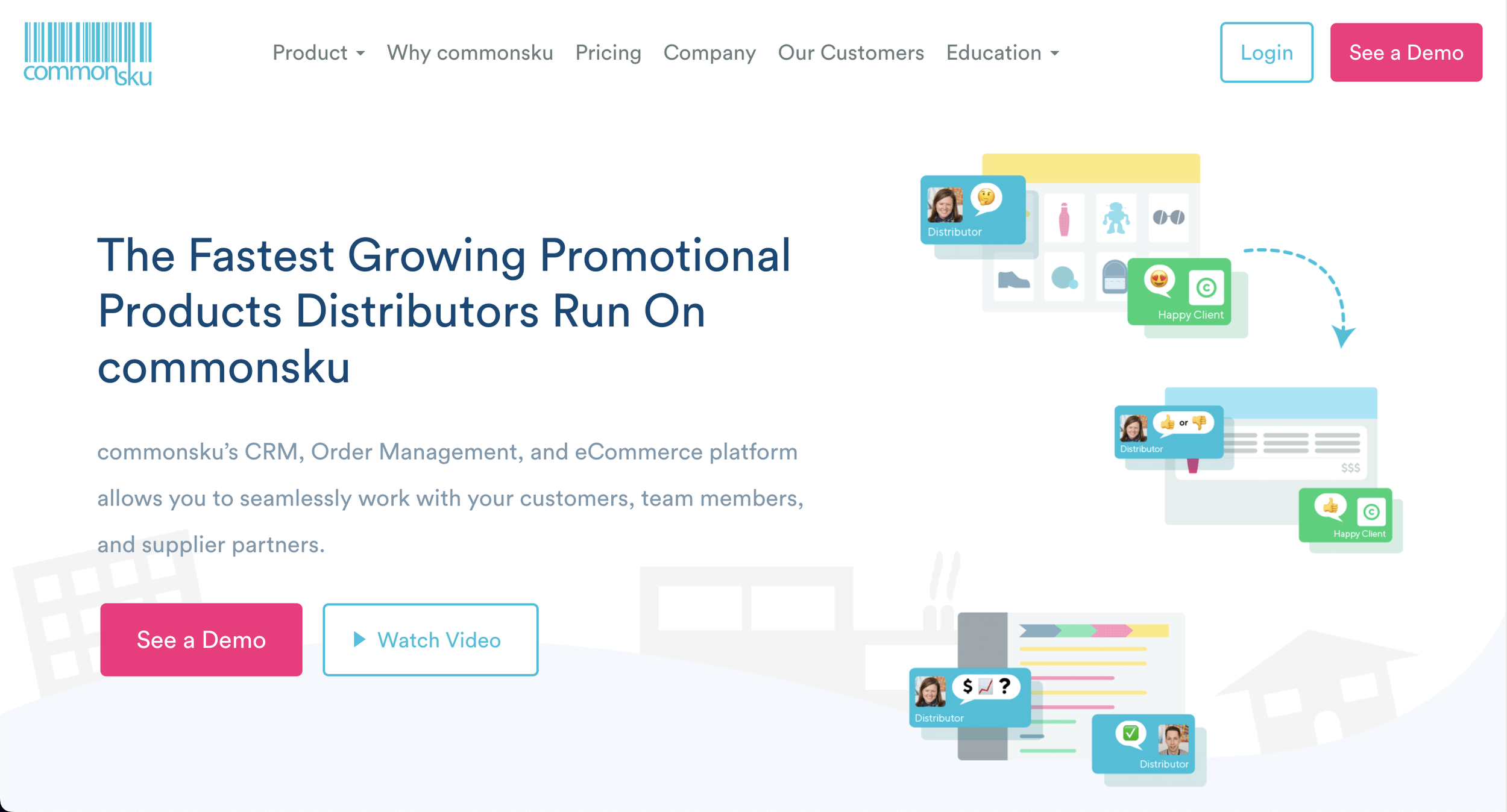
Our logos and skubot have been reimagined with a more contemporary, geometric design, enhancing their visibility and impact. The color system and typography have been refined, ensuring a consistent and organized brand identity. This transformation is consolidated into a comprehensive brand guideline, making it easier for everyone to represent commonsku accurately.
While the barcode concept remains at our core, we've simplified its design, eliminating intricate lines and updating our wordmark to TT Norms, reflecting our standardized font across our platform and materials.
skubot, too, has undergone a significant transformation, with a sleeker head design, rounded edges, and futuristic antennas – creating an iconic representation synonymous with commonsku.

Color Scheme Evolution


Website Homepage


Over the years, our brand has been shaped by the contributions of many talented individuals. Notably, Ilya Yakubovich, who is now our Director of Design, Musaa Sami who is now our User Experience Designer, and Lucia Kim, our Front-End Developer and Designer, the mastermind behind this brand refresh.
commonsku Application


You can check out our full brand refresh and updates on our brand assets page.
Our brand refresh is a testament to our commitment to growth and innovation. We're excited to share this brand evolution with you, our incredible community of partners and peers.